

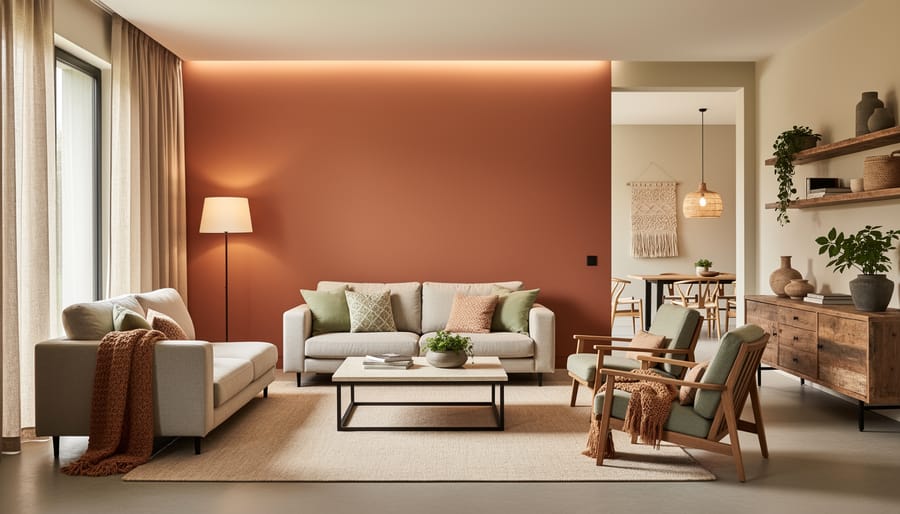
The home decor landscape has shifted dramatically this year, and color has emerged as the most powerful tool for transformation. Wellness-focused palettes anchored in nature now dominate interiors, with creamy terracottas, sage greens, and warm earth tones replacing the cool grays that defined the past decade. These hues pair beautifully with the natural materials flooding showrooms: limestone, raw linen, and reclaimed wood create spaces that feel grounded and restorative.
What makes this year different? Designers worldwide are blending cultural influences in unexpected ways. Japanese wabi-sabi aesthetics meet Mediterranean warmth, while Scandinavian minimalism softens through Indian textiles and Moroccan tilework. House Beautiful and Elle Decor both highlight this cross-cultural conversation as the defining characteristic of contemporary interiors.
The practical side matters just as much. Accessible design principles have moved beyond accommodation to become aspirational, with barrier-free layouts and adjustable lighting systems appearing in homes across income levels. Kitchens feature cabinets at varying heights, bathrooms include curbless showers, and living spaces prioritize flexible furniture arrangements that adapt to different needs throughout the day.
This approach isn’t about following rules. It’s about creating rooms that support how you actually live, incorporating colors and materials that calm rather than stimulate, and drawing inspiration from global design traditions that resonate with your personal story.
Earth-Inspired Color Palettes Dominating 2026
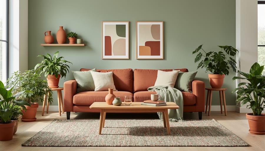
The design world has made a decisive break from the cool, sterile palettes that dominated recent years. Walk into any home being refreshed in 2026, and you’ll immediately notice the shift toward colors pulled straight from nature, think warm terracotta that mirrors sun-baked Mediterranean clay, rich browns reminiscent of freshly turned soil, sage greens echoing wild herbs, and ochres that could have been scraped from canyon walls.
This isn’t just an aesthetic choice. These earth-inspired palettes tap directly into the wellness-focused design movement reshaping homes this year. Research from Houzz and design forecasters shows that natural materials and earth-toned color schemes rank among the defining trends of 2026, creating spaces that feel inherently calming rather than visually stimulating. When your living room walls wear the muted green of olive leaves or your bedroom features clay-colored accents, your nervous system responds differently than it does to stark whites or industrial grays.
The practical appeal is equally compelling. Terracotta works beautifully whether you’re painting an accent wall, selecting throw pillows, or choosing ceramic vases. Deep earth browns provide a grounding backdrop that makes lighter furniture pop without the coldness of pure white. Sage green has become particularly versatile, it reads sophisticated in a home office, restful in a bedroom, and fresh in a kitchen.
What makes these colors feel so right in 2026 is their connection to broader cultural shifts. As Bontempi’s trend analysis notes, natural materials and earth-inspired palettes create more welcoming environments. They honor diverse design traditions too, from the terracotta-rich interiors of Mexican haciendas to the clay hues central to Japanese wabi-sabi aesthetics. These aren’t trendy colors that will feel dated next year. They’re timeless shades that happen to perfectly match where we are now: craving warmth, authenticity, and a tangible connection to the natural world inside our homes.
Rich Wood Tones Meet Crisp Neutrals
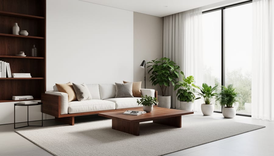
The marriage of deep, rich wood tones with crisp white and neutral walls has emerged as one of 2026’s most sophisticated and versatile design pairings. This contrast creates visual depth that feels both contemporary and enduring, allowing the natural beauty of wood grains to truly shine against clean backdrops. Unlike the matchy-matchy approach of previous years, this trend celebrates the tension between warmth and coolness, organic texture and smooth simplicity.
Walnut has become particularly popular for its chocolate-brown richness that reads almost luxurious against bright white walls. The pronounced grain patterns in walnut create natural artwork that doesn’t need additional embellishment. Oak, whether in honey tones or darker fumed finishes, brings a more casual warmth that works beautifully with softer neutrals like cream and greige. Cherry wood, which deepens to a reddish-brown over time, pairs especially well with warm white paint to create spaces that feel both refined and inviting.
The trend toward inset cabinetry with contemporary hardware showcases how these pairings work in practical applications. Picture deep walnut kitchen cabinets with brushed brass pulls set against walls painted in Benjamin Moore’s Simply White, or a white oak floating vanity contrasting with cool gray bathroom tiles. The wood provides organic warmth and visual weight while the neutral surroundings prevent the space from feeling heavy or dated.
This approach works across design styles too. Scandinavian interiors use light oak against stark white for an airy feel, while more traditional spaces might feature darker wood paneling against warm ivory walls. The versatility lies in the inherent balance: wood brings life and character, neutrals provide breathing room and sophistication.
The Return of Warm, Saturated Hues
The decade-long reign of cool grays is officially over. Designers and homeowners are embracing warmer, more saturated colors that inject personality and emotional depth into interiors. This shift reflects a broader cultural move toward creating spaces that feel genuinely lived-in rather than sterile showrooms.
Burgundy leads the charge, appearing on accent walls, upholstered furniture, and kitchen cabinetry. This wine-inspired shade brings sophistication without the coldness of its gray predecessor, creating intimacy in dining rooms and richness in living spaces. Deep forest greens follow closely, grounding rooms with a connection to nature while maintaining the dramatic presence homeowners crave.
Burnt orange has emerged as the unexpected hero of 2026, appearing in everything from throw pillows to powder room paint. Unlike the bright, 1970s-inspired oranges of years past, these are earthier, more complex tones that pair beautifully with natural wood and brass fixtures. Mustard yellow rounds out the palette, adding warmth to kitchens and entryways without overwhelming smaller spaces.
These saturated hues carry cultural significance across design traditions. In Mediterranean homes, terracotta and burnt orange have always signaled hospitality. Japanese design has long celebrated deep greens as symbols of tranquility. By bringing these colors into contemporary interiors, homeowners honor diverse aesthetic legacies while creating spaces that reflect their individual stories.
The psychology matters too. Warmer colors increase perceived coziness by creating visual weight and emotional warmth. They make large, open-plan spaces feel more intimate and transform underused rooms into destinations. Unlike neutrals that fade into the background, these colors demand attention and spark conversation, turning homes into expressions of personal style rather than generic backdrops.
Soft Color Palettes for Wellness-Focused Spaces
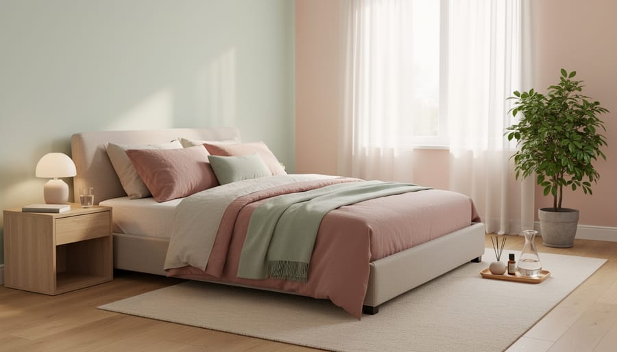
Soft pastels aren’t about baby-nursery pastels anymore. This year’s wellness-focused color movement centers on sophisticated, muted tones that create visual calm without feeling childish or overly sweet. Dusty blues, blush pinks with gray undertones, warm lavenders, and barely-there greens form the backbone of spaces designed to reduce stress and support mental well-being.
Soft, muted palettes help reduce visual noise and create environments where the nervous system can genuinely rest, making them essential for wellness-oriented design in 2026.
These colors work particularly well in bedrooms and bathrooms, where creating a sanctuary feel matters most. A dusty blue-gray on bedroom walls paired with crisp white linens transforms sleep spaces into retreats from overstimulation. Soft blush tones in bathrooms create spa-like environments without the clinical feel of stark white. The key is choosing colors with enough gray or brown mixed in to feel grounded rather than saccharine.
The wellness connection runs deeper than aesthetics. Research into color psychology shows that overly saturated or high-contrast environments can increase cortisol levels, while gentler palettes promote relaxation. That’s why these soft tones pair so naturally with restful bedroom ideas like layered textiles, dimmable lighting, and natural materials.
You’ll see these palettes work beautifully with the rich wood tones trending this year. A warm lavender wall against walnut furniture creates sophisticated contrast without visual tension. Pale sage cabinetry in bathrooms offers a fresh take on neutrals while maintaining that calming quality. Mix these soft colors with the earth-inspired palettes in adjacent rooms for a cohesive flow that feels intentional rather than matchy.
How to Mix Modern Colors with Classic Design Elements
The magic of blending old and new lies in creating tension that feels intentional rather than accidental. Start with your architectural bones, crown molding, wainscoting, traditional door profiles, and let 2026’s trending colors breathe fresh life into them. A classic five-panel door painted in deep terracotta or dusty sage instantly becomes contemporary while respecting its heritage. The same principle applies to cabinetry: inset door styles paired with modern hardware in matte black or brushed brass, then finished in warm clay tones or rich burgundy, bridge generations of design philosophy.
Wood finishes offer another powerful mixing opportunity. Place a walnut credenza or oak dining table, those rich wood tones trending this year, against walls painted in crisp white or soft neutral shades. The contrast creates breathing room that makes both elements shine. You can brighten dim rooms by choosing lighter wall colors while keeping statement furniture pieces in those deeper wood tones that anchor the space.
Cultural design elements thrive when you apply a modern color lens. Consider a traditional Moroccan tile pattern rendered in muted lavender and cream instead of the expected jewel tones, or Japanese shoji screens paired with walls in burnt orange rather than stark white. These updates honor cultural heritage while embracing current palettes.
The key is maintaining balance. If your furniture leans traditional, think Chesterfield sofas or wingback chairs, paint your walls in one of 2026’s warmer, saturated hues like mustard yellow or deep green. Conversely, if your architecture is ornate and classical, choose contemporary furniture in clean lines but dress it in those earth-inspired colors. Mix eras confidently, but let color be your unifying thread rather than trying to match every piece to a single period.
Room-by-Room Color Applications for 2026
Applying 2026’s color trends room by room lets you create a cohesive home that balances wellness, accessibility, and personal style. Each space has unique functional needs that pair naturally with this year’s earth-inspired and saturated hues.
| Space | Recommended Palette | Mood Created | Key Consideration |
|---|---|---|---|
| Living Room | Terracotta, sage green, warm oak | Welcoming, grounded | Anchor with rich wood tones |
| Kitchen | Deep walnut, crisp white, clay accents | Sophisticated, timeless | Balance dark cabinetry with bright walls |
| Bedroom | Dusty blue, soft pink, lavender | Restful, calming | Prioritize low-stress hues |
| Bathroom | Muted pastels, warm neutrals, earth tones | Spa-like, serene | Layer textures in similar tones |
For your living room, terracotta walls paired with sage green upholstery create an inviting gathering space that feels connected to nature. Anchor the palette with warm wood furniture in walnut or oak finishes, letting these rich tones contrast against neutral rugs. This combination supports the wellness-focused design movement by reducing visual chaos while maintaining visual interest.
In the kitchen, embrace trending kitchen design by pairing deep wood-tone cabinetry with crisp white or soft cream walls. Add clay-colored tiles as a backsplash or bring in burnt orange accessories through bar stools or dishware. The contrast between dark and light creates accessible, functional spaces that don’t sacrifice style.
Bedrooms benefit most from the softer end of 2026’s spectrum. Dusty blues on the walls promote rest, while soft pink bedding or lavender accent pillows add warmth without overstimulation. These muted pastels align with research showing that calming colors support better sleep and reduced stress.
Bathrooms are your chance to experiment with layered earth tones. Try warm beige walls with terracotta towels and natural stone accessories. For more inspiration on creating spa-like retreats, explore bathroom color ideas that blend wellness principles with contemporary aesthetics. Adding plants in these spaces reinforces the connection to natural materials while purifying the air.
The color trends defining 2026 homes tell a bigger story than aesthetics alone. They reflect our collective movement toward spaces that nurture well-being, respect the environment, and welcome diverse cultural expressions. Whether you’re drawn to earth-inspired terracottas, the grounding presence of rich wood paired with crisp whites, or the calming influence of soft wellness-focused palettes, these aren’t arbitrary fashion shifts, they’re responses to how we want to live now.
What makes 2026’s color palette particularly exciting is its flexibility. These trends don’t demand you abandon your heritage, your memories, or your personal style. A Japanese-inspired minimalist can layer dusty blues and natural woods just as successfully as someone blending Moroccan terracotta with contemporary furnishings. The key is choosing colors that resonate with your story while creating spaces that actually support your daily life.
Start small if you’re hesitant. Swap out throw pillows in saturated burgundy, paint a single accent wall in sage green, or introduce warm wood tones through a new coffee table. Your home should feel both current and completely yours, a place where trending colors meet timeless comfort. Trust your instincts, honor what makes you feel at ease, and remember that the most successful spaces always balance what’s stylish with what’s genuinely livable.
